• ABOUT US
  • WHY BLOC?
  • SERVICES
  • COMMUNITY
  • CONTACT

MLJ Rebrand Campaign: A Fresh Look for a Trusted Supplier

OVERVIEW

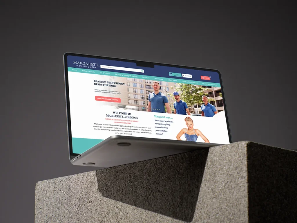
Margaret L. Johnson (MLJ) has long been a cornerstone of the UK’s office supplies market – an independent, family-focused supplier with deep regional roots and a reputation for personal service and reliability. Serving hundreds of businesses monthly, MLJ offers everything from stationery and branded workwear to office furniture, cleaning supplies, and secure waste services.

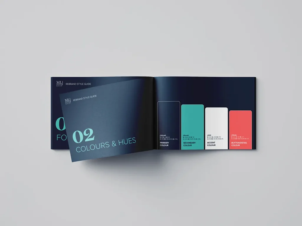
As the business evolves and seeks to modernise its brand, MLJ launched a rebrand campaign centred around a refreshed logo design and a reimagined homepage, designed to reflect its values of trust, service, and ease.

THE CHALLENGE

MLJ’s long-standing reputation was unquestioned, but online, the brand’s presentation needed revitalisation to match its trusted service. The existing online presence leaned on traditional styling and messaging that didn’t fully represent its modern ambitions or invite deeper engagement from new and returning customers.

MLJ needed:

  • A modern, polished logo to elevate brand recognition.
  • A homepage redesign that communicated core brand values clearly and visually.
  • Enhanced functionality and clarity to guide visitors toward browsing categories, promotions, and trust-building testimonials.

THE SOLUTION

Our creative team developed a cohesive rebrand with:

  • Logo Redesign: A fresh, modern mark was crafted to balance MLJ’s heritage with contemporary style—conveying simplicity, professionalism, and approachability.
  • Homepage Overhaul: The homepage was restructured to present an inviting, user-friendly experience:
    • Strong lead messaging of “WORKPLACE ESSENTIALS. PERSONAL SERVICE. NATIONWIDE DELIVERY” was retained and enhanced, reinforcing MLJ’s core identity.
    • Clear calls-to-action were built around browsing product categories, special offers, and convenient tools like the Ink/Toner Finder.
    • Customer testimonials emphasizing long-term loyalty and personal service were preserved prominently.
    • Visual hierarchy was improved with spacious layouts and refined typography to guide the customer journey from awareness to exploration.

THE RESULT

The rebrand delivered substantial benefits:

  • Renewed Brand Confidence
    The refined logo and cleaner homepage gave MLJ a more professional, trustworthy, and inviting look—without losing its personal, community-focused ethos.
  • Enhanced User Experience
    With improved navigation, clearer messaging, and better visual organization, visitors can quickly understand MLJ’s services, browse categories, and access special offers.
  • Stronger Engagement Potential
    The updated homepage layout and tone invite clients to explore and engage—setting the stage for increased conversions and sustained loyalty.
Facebook
Twitter
LinkedIn

Member Login